The Monogram at East Bay
AGENCY: BLUE ION
Services: Art Direction, Brand Identity, Print Collateral, WEB DESIGN
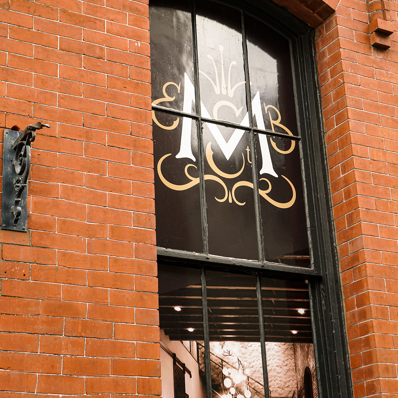
The Monogram is a high end multi-floor wedding/event space located in the historic downtown Charleston, SC area. Built in 1880, this historical building became the focal point for all the branding work. While at Blue IOn, I was assigned creative lead where our team was a part of naming, branding, and marketing the Monogram brand. The mark depicts the “M,E,B,ST.” initials (Monogram East Bay Street) and embellishments resembling a crown. Additional tasks included creating branding materials, window wraps, and a teaser landing page for inquiries.

DISCOVERY & EXPLORATION
The monogram on east bay began when the location was acquired in historic downtown Charleston SC. This historic building became the central focus of what would be one of the leading wedding and corporate events spaces. The client approached Blue Ion, needing assistance with developing a name, brand, website, and story that would allow this event space to stand above the competition. Charleston has long been known for a destination location for events and weddings, the saturated market became the challenge to overcome.
I was appointed creative lead to work alongside talented copywriters, project managers, and programmers to help define this brand and establish a creative position to distinguish itself from competitors. We begin by answering one question, who are our customers? The 161 East Bay Street location was a prime location that held a view of the harbor and city, unlike any other. This was also the location of a majority of high-end restaurants and hotels. The targeted wedding and event prices were set 100k and up.
PROJECT TYPE
COLLABORATION WITH COPY DIRECTOR, WEB DEVELOPER, AND PROJECT MANAGER
TIMELINE
may - JUL 2019 (16 WEEKS)

PROCESS OVERVIEW
I explored various branding directions that took the mark from an elegant/regal approach through iterations using simple formal serif type treatments. My goal was to develop a branding system that spoke to the history of the build and area along with the high price point. Many directions were inspired by architectural elements on the exterior of the building.


FINAL DESIGN SOLUTION
The final mark arrived with a combination of a custom embellishment surrounding the “M”. The embellishments were illustrated to read “EB St.(East Bay Street)” this mark was accompanied by a modified type treatment based on Baskerville.


FINAL DESIGN SOLUTION
The branding materials were eventually used to help with the window wrap designs. During the time of the building renovation, the large East Bay and Queen St. facing windows became the perfect opportunity to market the new brand and promote the Monograms event opportunities.
Some of the factoring problems we faced were from the lack of content of images of the event space. Due to the building renovations, the only images that we had were based on construction renderings. This prevented us from really showing-off the amenities and key features. The conclusion was to use stock imagery that showcased the feeling/aroma that The Monogram wanted to have. And for the majority of the window real-estate, I decided to use the branding materials such as the new logo, brand patterns, manifesto to set the tone for what will be expected of the opening of the building.